





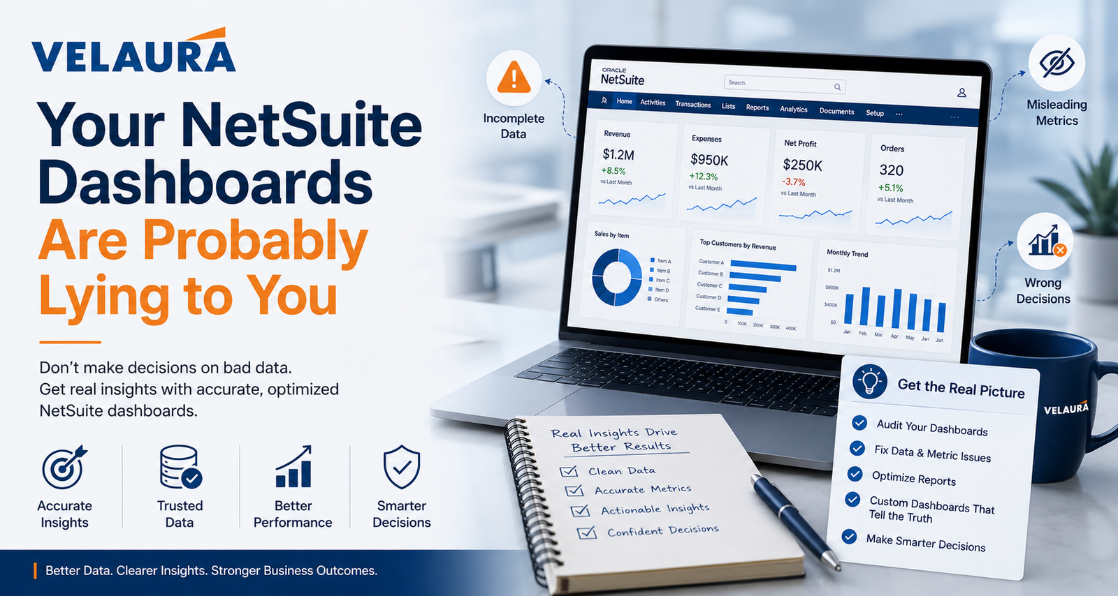
Your NetSuite Dashboards Are Probably Lying to You: How to Build Reporting Leaders Actually Trust
The numbers look fine. That is exactly the problem. Here is why NetSuite dashboards drift away from the truth, and how to build reporting your leadership will rely on without re-checking it.
The dashboards load. The tiles are green, the charts trend up and to the right, and nobody questions them. That last part is the problem. A dashboard does not have to be wrong to mislead you. It only has to be trusted more than it deserves.
NetSuite reporting is genuinely powerful, which is part of the trap. The platform will happily show you a number that is technically correct and practically misleading, and it will look just as confident doing it. Over time, small distortions creep in, people quietly lose faith, and the real decisions start happening in spreadsheets again. This is rarely a NetSuite fault. It is almost always a design and discipline problem, and that means it is fixable.
Key Takeaways
- A dashboard can be technically accurate and still misleading. Trust is earned through design and discipline, not by looking polished.
- The usual culprits are mismatched filters, role based data differences, saved search versus report logic, refresh and caching, and metrics nobody agreed on.
- Two people seeing different numbers in NetSuite is often correct behavior, driven by roles and access, not a bug.
- Reporting nobody trusts is expensive: it breeds shadow spreadsheets, slows decisions, and quietly erodes confidence in the whole system.
- Trustworthy reporting starts with the decision, agrees one definition per metric, ties out to a known source, and is owned by someone.
Why dashboards drift away from the truth
Almost no one sets out to build a misleading dashboard. They drift there gradually. A dashboard is created for a specific purpose, then a filter is tweaked, a new metric is bolted on, a saved search is copied and edited, and roles change as people come and go. Each small change is reasonable on its own. Together they pull the dashboard a little further from the truth it was built to show, and because the layout never changes, no one notices the meaning has.
The deeper issue is that a dashboard looks authoritative by default. A neat tile with a big number and a green arrow carries a confidence the underlying data may not have earned. People act on what looks finished. The job of good reporting is to make sure that confidence is deserved.
The usual suspects
When a NetSuite dashboard misleads, the cause is usually one of a familiar handful. None of them are exotic, and all of them are addressable once you know to look.
Filters quietly doing the wrong thing
The most common culprit is the least dramatic: a date range, subsidiary, or status filter set once and then forgotten. A revenue tile that silently excludes one channel, or a pipeline view stuck on last quarter, will look completely normal while telling you something untrue. The number is real. The question it is answering is not the one you think.
Role based data, working exactly as designed
If two people look at the same dashboard and see different totals, the instinct is to call it a bug. Often it is the opposite. NetSuite shows data according to each user's role, permissions, and subsidiary access, so a regional manager and a group controller can legitimately see different numbers from the same dashboard. That is correct behavior, but if no one understands it, it quietly destroys trust in the report.
Saved searches and reports that disagree
NetSuite can produce a similar looking result through more than one tool, and they do not always calculate the same way. A saved search and a standard report can each be right by their own logic and still return different totals because of how they group, filter, or count. When a dashboard mixes sources without anyone reconciling them, two tiles can disagree and both look authoritative.
Refresh, timing, and the meaning of real-time
Most NetSuite data is current, but not every dashboard element updates the instant you look at it. Some portlets refresh on a schedule or reflect the last time a search ran, so a tile can lag reality by minutes or longer. That gap matters most exactly when things are moving fast, which is when people lean on the dashboard most.
Metrics nobody actually agreed on
Ask three departments to define revenue, an active customer, or an open order and you will often get three answers. When each team builds its own version, the same word means different things on different dashboards, and leadership ends up adjudicating between numbers instead of making decisions with them.
Dirty data underneath
Duplicate customer records, inconsistent item naming, and stale entries inflate counts and split totals in ways no dashboard can correct for. A report can only be as honest as the records beneath it.
The real cost of reporting nobody trusts
An untrustworthy dashboard rarely causes a single dramatic failure. It does something slower and more expensive. People stop relying on it and start rebuilding the numbers themselves, which is how an organization ends up with a NetSuite instance and a parallel universe of spreadsheets that quietly becomes the real source of truth.
From there the costs compound. Decisions slow down because every number has to be re-checked before anyone acts. Meetings get spent debating whose figure is correct rather than what to do. And the credibility of the whole system takes the hit, because once leaders learn not to trust one dashboard, they extend that doubt to all of them. Reporting you cannot trust is worse than no reporting, because it still demands the work while removing the confidence.
If a leadership meeting routinely opens with someone asking why two reports do not match, the problem is not the meeting. It is that no one agreed what the metric means, where it comes from, or which view is the official one. Fixing the definition fixes the meeting.
How to build reporting leaders trust
Trustworthy reporting is less about clever charts and more about a few habits applied consistently. The goal is simple to state: a leader should be able to look at a number and act on it without rebuilding it first.
Start with the decision, not the chart
Every dashboard element should exist to support a specific decision or answer a specific question. If you cannot say what someone is supposed to do differently because of a tile, it is decoration. Designing backward from the decision strips out vanity metrics and keeps reporting focused on what matters.
Agree one definition per metric
Pick a single, written definition for each important measure, revenue, margin, an active customer, an open order, and use it everywhere. A shared definition is what turns competing numbers into one number, and it is the single highest leverage step in making reporting trustworthy.
Design dashboards for roles on purpose
Rather than letting role based differences surprise people, design for them. An executive view, a finance view, and an operations view should each show the right data for that audience, and everyone should understand why their numbers may differ. Intentional role based dashboards turn a source of confusion into a feature.
Tie out to a known source
A dashboard earns trust when its numbers reconcile to something already believed, most often the general ledger or another agreed record. Reconciling key figures, and being able to trace a tile back to the transactions behind it, is what lets people stop double checking.
Fix the data and give reporting an owner
Clean, well maintained records are the foundation everything else sits on. And someone needs to own reporting: to approve new dashboards, retire stale ones, and keep definitions honest. Reporting without an owner drifts straight back into the mess it came from.
A simple test for any dashboard
You do not need to be technical to pressure test a dashboard. Three questions will expose most of the trouble.
- Can you trace a number to its source? Pick a tile and ask to see the records behind it. If no one can show you, the number is faith, not fact.
- Does it tie out? Does the figure reconcile to the general ledger or another trusted source? If it cannot be reconciled, it cannot be trusted.
- Does it drive a decision? If you cannot name what someone would do differently because of it, the tile is taking up space that a useful one could fill.
Run those three questions across a dashboard and you will quickly see which numbers have earned their place and which are just sitting there looking confident. The ones that pass are the beginning of reporting your leadership can finally rely on. Getting there is also one of the highest return moves in any NetSuite optimization effort, because trustworthy reporting is what lets every other improvement actually be measured.
Frequently asked questions
Why do two users see different numbers on the same NetSuite dashboard? +
Why don't my NetSuite reports and saved searches match? +
Are NetSuite dashboards real-time? +
Why do my dashboard numbers not tie to the general ledger? +
How do I build NetSuite dashboards leadership will trust? +
Can Velaura help fix our NetSuite reporting? +
ERP consultants who make NetSuite numbers trustworthy
Velaura is an ERP consultancy working in NetSuite and Oracle since 2013. We help organizations get everything they are paying for out of their technology, with a straightforward, results first approach. Reporting is often where we start, because a business that cannot trust its own numbers cannot confidently improve anything else.
Do your dashboards earn the trust they get?
If leadership quietly re-checks the numbers before acting, the reporting has a problem worth fixing. Velaura can help you build dashboards your team relies on.
Get a NetSuite Reporting Review